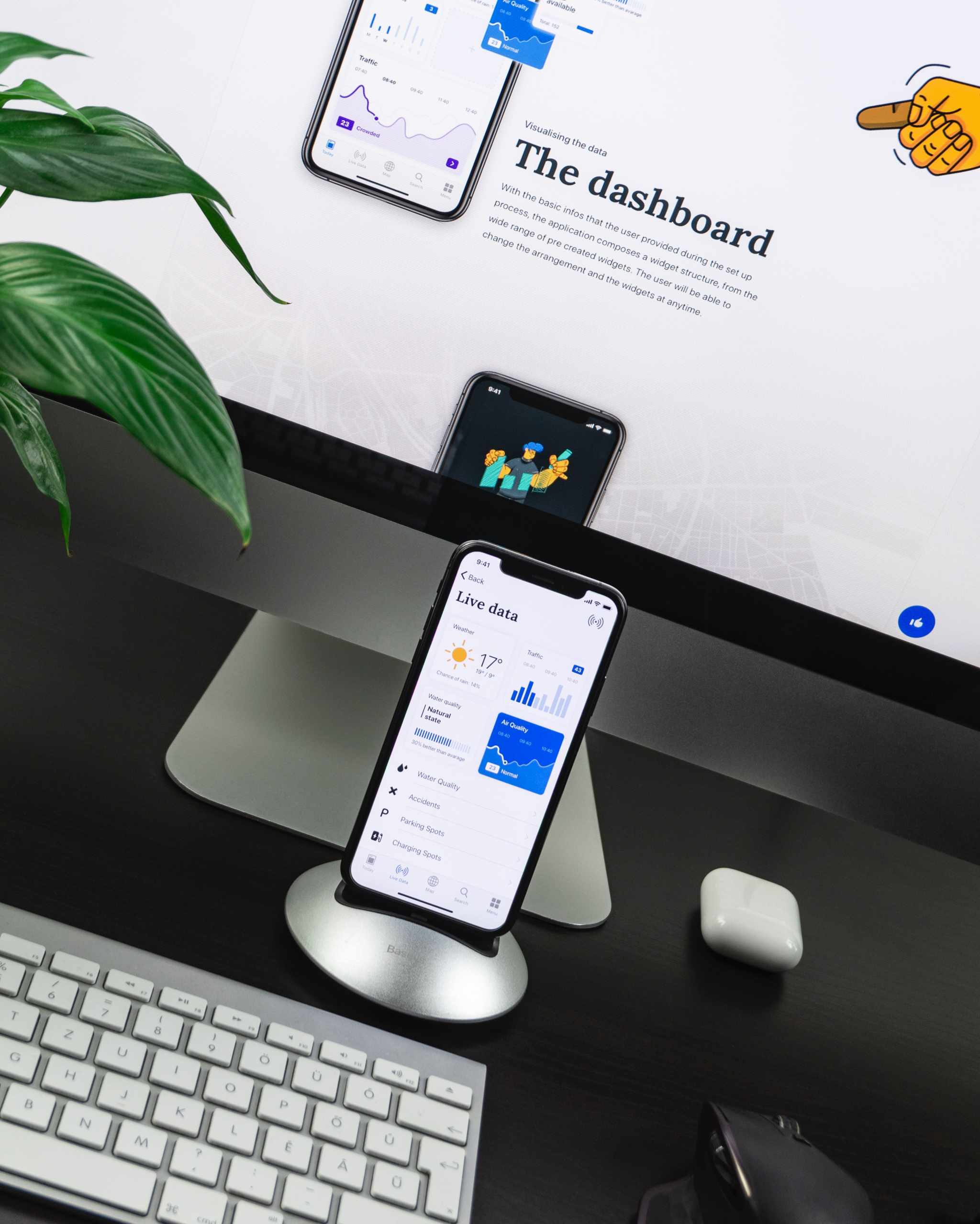
Mobile phones will account for more than half of the devices used to browse online websites by 2022, therefore only a handful will be able to avoid optimizing for smartphones.
We know that today’s phones are actually miniature computers, and how practical they are for their users is clearly shown by the fact that back in 2015, mobile search became dominant in relation to surfing the Internet on a desktop PC. In 2021, the situation has gone a little further on the side of mobile phones, which make up close to 58% of all visitors to the Internet, with PCs contributing roughly to 42% of the total. Tablets and other comparable devices account for the rest.
That’s why companies that optimize online websites for mobile phones are flourishing today, and there are also applications, as an even faster way to get information, i.e. to your own user account on the Internet.
Why Do People Prefer a Cell Phone to a Computer?
One of the reasons why a mobile phone has become so convenient to use is definitely that you can use it on the go. It’s no problem to take it out of your pocket and do what you plan on the Internet, whether it’s getting valuable information, shopping, learning, having fun, or communicating.
Yes, the laptop seemed very practical at a time when there were no small computers that you didn’t have to hold in your lap and look for an outlet for it. Now the situation has completely changed. That’s why most online websites need optimization for mobile phones, so today everyone is trying to offer users a great experience of accessing the site while on the go. Even graphical editing tools and stock pages, which would normally require at least two screens, now have mobile-optimized versions, demonstrating how far things have progressed.
Which Industries Have Switched to Mobile?
There are many who can be said to have completely moved away from the desktop interface and focused all their efforts on optimization for mobile phones. This certainly includes news portals, which have over 70% of users from smart devices, and the same goes for social networks.
Let’s not forget the online casinos, as well as other organizers of games of chance, in whose branches people, not so long ago, were waiting in front of the counter to pay for slips, and today they can do it in a second, on their mobile device. It’s now inconceivable that someone offers users sports betting or casino games without providing access to their offer through an online site. In fact, most organizers, like those at TopCasinoExpert.com, also have apps available, even faster and better suited to mobile than web browser versions.
Dating sites have also completely switched to mobile phones and operate via apps, and thanks to mobile banking as the latest trend in money transactions, e-commerce via smartphones has also flourished. However, those who run a webshop must know that the conversion rate for most industries is still higher for the computer, when people sit down and think in peace before buying, so it’s necessary to optimize online shopping for both mobile and desktop interfaces.
What’s Most Important When Optimizing for a Mobile Phone?
If you want to move your page from the desktop to the mobile interface, the first thing you need to do is make the cover easy to navigate. It must contain the most important information and the opportunity to intuitively reach everything that interests the user. That’s why they aren’t good crowded covers for the mobile interface, and it’s important to know how to use the mobile drop-down menu, to keep everything clear and allows the user to easily access the desired services or information. As we’ve already mentioned betting shops, casinos, and games of chance, in addition to good navigation, the availability of video transmission is also crucial, i.e. the flawless operation of various graphically refined games, with the support of mobile phone working memory.
On the other hand, the most important thing for a webshop is that it’s always possible to reach the page of the desired product, where you’ll then find a clear and concise description, as well as a noticeable price. Of course, the payment process must be reliable and secure. On a mobile phone, a larger font normally helps to make the website more readable, and the format of the photographs differs from the desktop, with vertical photos looking better, which should also be taken into consideration.
In any case, mobile phones as a means of searching the Internet dominate today, and sitting in a computer office and trying to optimize the desktop version for your users is a tactic from the past that won’t bear fruit if you don’t pay special attention to the functionality of your mobile site.
